Mini LED Neon Flex for Small Channel Letters and Tight Signage
- 2026-09-30 17:38
- /
- Arraystar LED
Small channel letters, compact logos and intricate signage have always been the hard case for neon - tight strokes, narrow fonts and small graphics demand a light source that bends and cuts at a scale ordinary neon flex can't follow. Mini and ultra-slim neon families, down to a few millimeters with very short cut intervals, are built specifically for these fine strokes, letting you render small text and detailed logos cleanly. The whole job is matching neon cross-section and cut increment to the letter stroke width and internal radius.
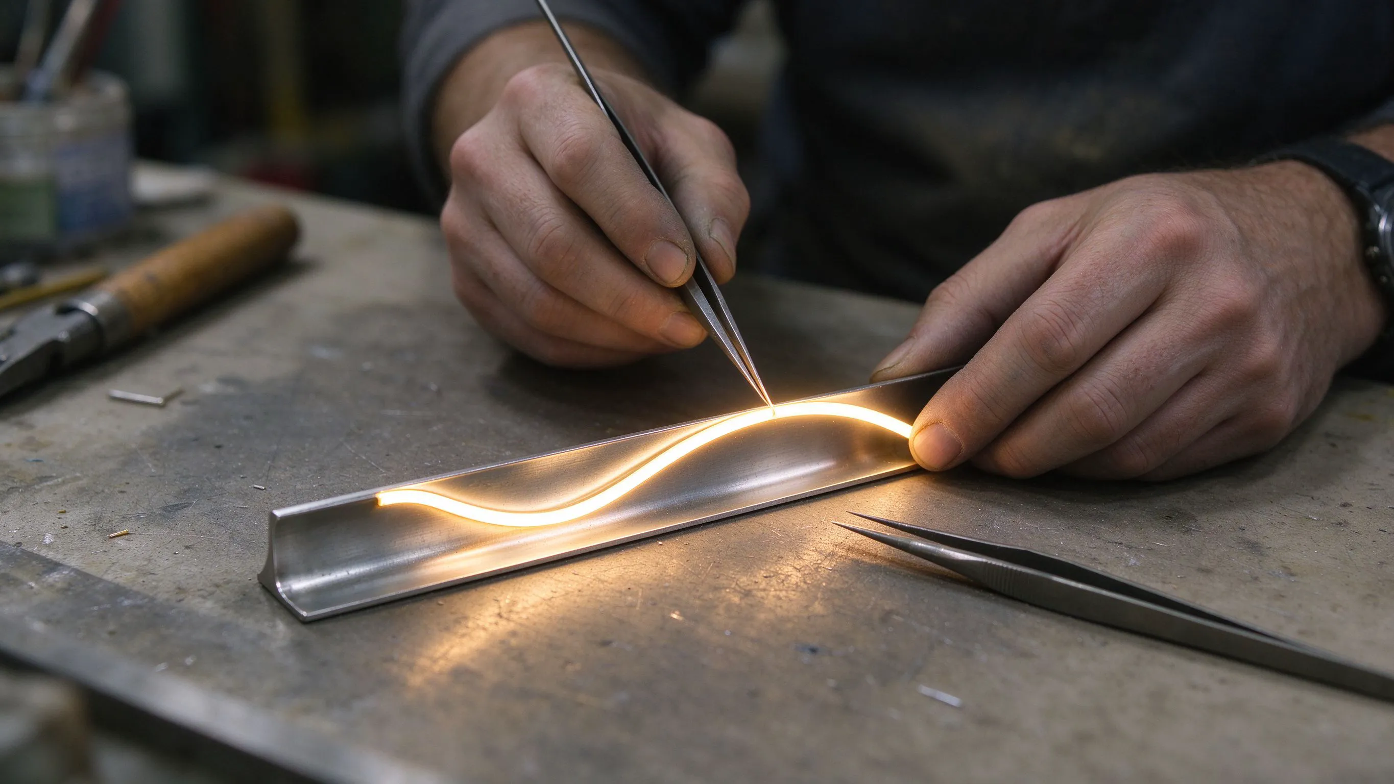
Small Lettering Breaks Standard Neon
Channel letters and neon-style logos get dramatically harder as they get smaller. A standard 12x12mm neon can't follow the tight internal radius of a small 'e' or a narrow logo mark without kinking, and long cut intervals leave dead tails that don't fit short strokes. Forcing full-size neon into small letters produces bulging corners, dark gaps and distorted shapes.
The signage industry solved this with mini and ultra-slim neon families - small cross-section bodies with short free-cut intervals engineered to trace fine strokes and tight curves. Specifying them correctly is a matter of matching the neon's size and bending behavior to the actual geometry of the letters, not just picking the smallest product on the shelf.
Mini Free-Cut Neon for Compact Channel Letters
Mini 0306 free-cut neon flex is a small cross-section (roughly 3x6mm class) product with very short cut intervals, designed to trace the narrow strokes and tight radii of compact channel letters and small logos. Its small body fits inside shallow, narrow letter returns that full-size neon couldn't physically enter.
Use the 0306 for small interior signs, counter logos and compact branded graphics where stroke width is only a few millimeters. The free-cut capability means each short stroke - the crossbar of an 'A', the tail of a 'K' - can terminate cleanly without a leftover dark segment, which is what gives small letters their crisp, finished appearance.
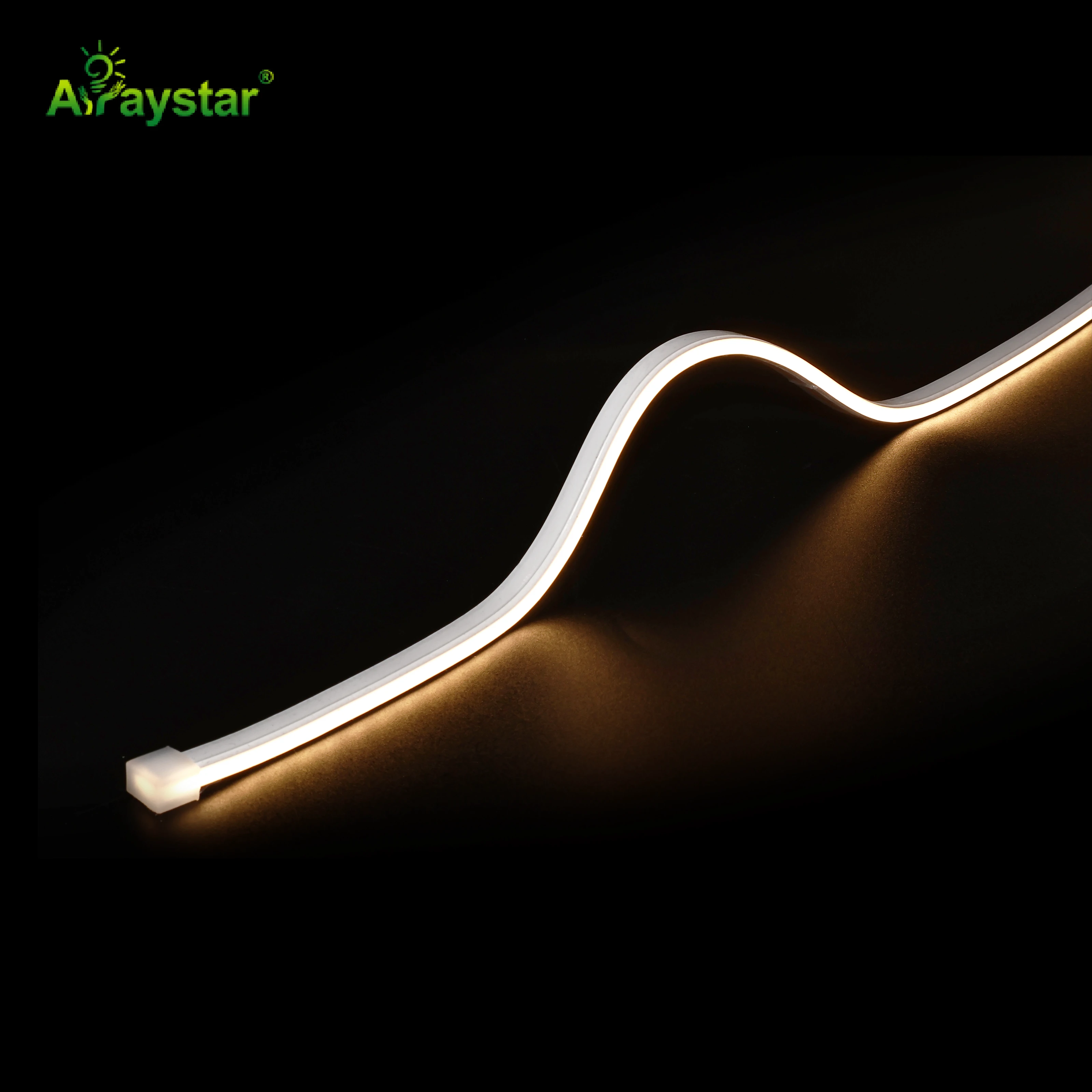
Matching mini neon size to letter scale.
| Neon size | Cross-section class | Best for |
|---|---|---|
| Mini 0306 | ~3x6mm, tight | Small interior letters, counter logos, fine marks |
| Mini 0404 | ~4x4mm | Compact letters, balanced stroke and radius |
| Slim 2x6 type-C | ~2x6mm flat | Ultra-fine flat strokes, thin fonts, detail |
| Standard 12x12 | ~12mm | Large letters, building signs, long view |
Balancing Stroke Width and Bend Radius
The 0404 mini free-cut neon (around 4x4mm) is the balanced middle choice for compact channel letters that need a little more glow and easier handling than the smallest product, while still following tight letterforms. The slightly fuller cross-section reads better at moderate viewing distance without bulging out of small returns.
The practical rule is to choose the largest neon that still cleanly follows the smallest internal radius in your design - larger bodies glow more evenly and are more forgiving to install, but only if they can physically make the tightest curve. Measure the narrowest stroke and tightest corner in the artwork and spec from that, not from the largest letters.
Ultra-Slim Flat Neon for Thin Fonts and Fine Detail
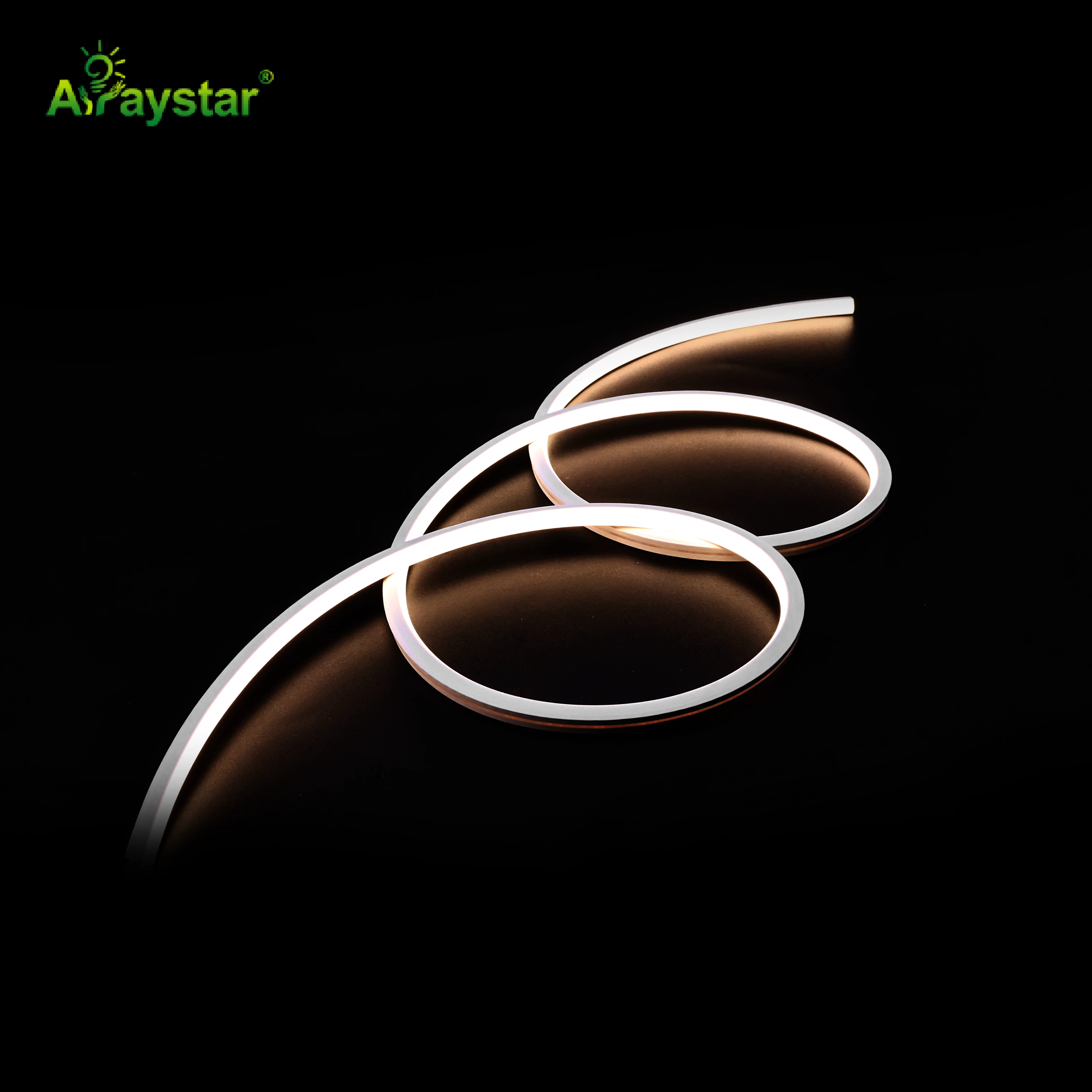
Some designs call for genuinely hairline strokes - thin script fonts, delicate line-art logos, fine borders and small text where even 3mm round body is too chunky. A Type-C slim 2x6mm neon strip is a flat, very narrow profile made for these ultra-fine lines, bending around detail that round mini neon can't.
The slim 2x6 Type-C renders thin elegant scripts and fine outline logos as a clean hairline of light, and its flat form sits neatly in very shallow letter faces and on flat sign backings. It's the specialist tool at the fine end of the range - reach for it when the design's identity depends on delicacy rather than bold glow.
Routing, Power and Crafting the Letters
- Match neon cross-section to letter return depth and stroke width before fabrication.
- Spec from the tightest radius in the artwork, not the largest letter.
- Use free-cut products so short strokes terminate with no dark dead tails.
- Plan the power feed to enter at a natural letter junction or mounting point.
- Secure mini neon with the matched small clips/track; adhesive alone is unreliable.
- Test-bend a sample of the tightest letter before committing the full run.
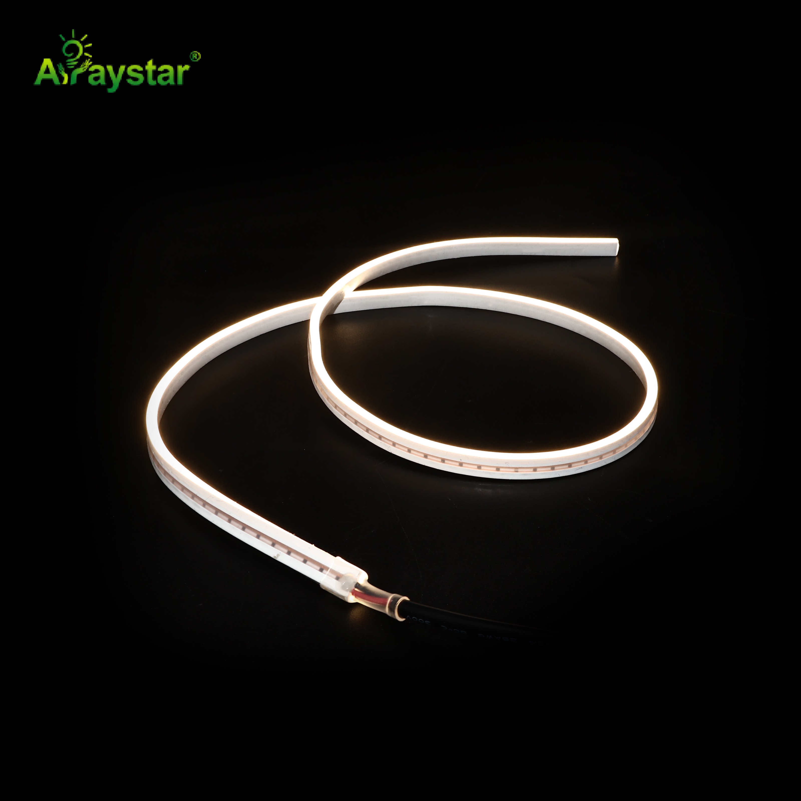
Small neon is less forgiving of rough handling than full-size flex, so fabrication care matters more - pre-form curves, use the correct mini track, and keep wiring tidy within the letter returns. Done well, mini neon lets you produce small, intricate signage that would have required expensive hand glass work just a few years ago.
Recommended Products
Frequently Asked Questions
What neon flex size do I need for small channel letters?
Use mini free-cut neon matched to the letter geometry: ~3x6mm (0306) for small interior letters and counter logos, ~4x4mm (0404) for compact letters wanting a bit more glow, and a slim 2x6mm flat Type-C for ultra-thin scripts and hairline logos. Choose the largest body that still follows the tightest radius in the artwork.
Why does regular neon look bad in small letters?
Standard ~12mm neon can't follow the tight internal radius of small characters without kinking, and its long cut intervals leave dark dead tails on short strokes, causing bulging corners and gaps. Mini neon's small cross-section and short free-cut increments trace narrow strokes and terminate cleanly, keeping small letters crisp.
What does free-cut mean for neon signage?
Free-cut (or very short cut interval) neon can be trimmed at frequent, closely spaced points rather than only every several centimeters, so each short letter stroke can end exactly where it should with no leftover dark segment. That's essential in small channel letters where strokes are only millimeters long.
How do I choose between round mini neon and flat slim neon?
Use round mini neon (0306/0404) for conventional channel letters with depth and compact glowing strokes viewed face-on, and the flat slim 2x6 Type-C for ultra-thin flat fonts, delicate line-art and hairline outlines on shallow faces. Round gives body, flat gives fineness.
How tight can mini neon bend inside letters?
It depends on the cross-section - the smallest 0306 and slim 2x6 products make the tightest curves, while the 0404 needs a slightly larger radius. Always measure the tightest internal corner in the artwork and spec the neon from that, and test-bend a sample of the tightest letter before fabricating the full sign.
Need help with your LED project?
Get factory-direct pricing, free samples and engineering support within 24 hours.
Email: info@arraystarled.com | Phone: +86-0755-2103-6746 | WhatsApp: 0086 1581 8514 077
Need to size your power supply? Use our LED Strip Power Calculator to find the right driver in seconds.