Neon Flex Size Chart: Matching Tube Cross-Section to Letter Height
- 2026-10-09 18:39
- /
- Arraystar LED
Neon cross-section should be chosen from letter height, stroke width and viewing distance, not from whatever tube happens to be in stock. Too small and the sign disappears; too large and the neon crowds the stroke and bleeds light into the counters. I keep a simple size chart and confirm every job against a full-scale mock-up before extrusion or ordering.
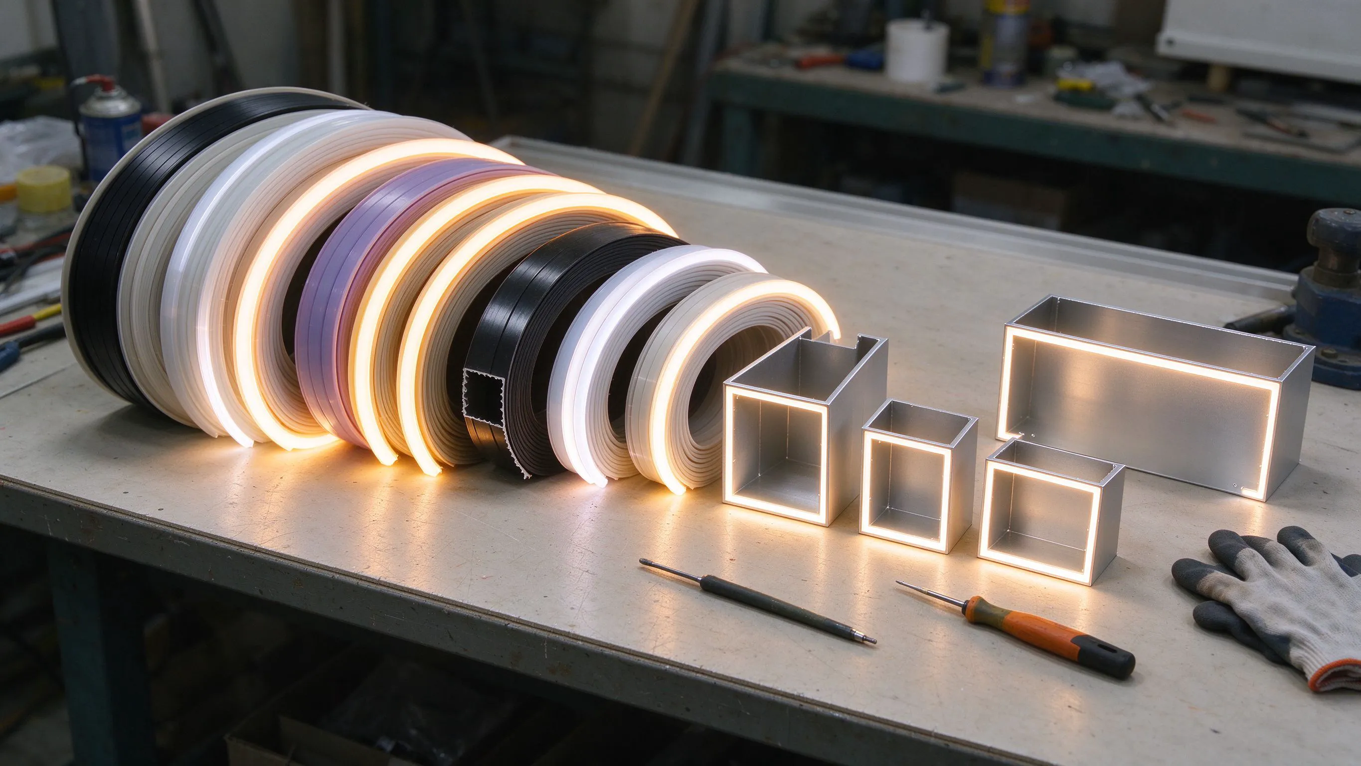
Why Size Is the First Decision, Not the Last
When a sign shop calls asking for 'neon LED strip', the first question I ask has nothing to do with colour or voltage. I ask how tall the letters are and how far away people will read them. Those two numbers narrow the tube size before anything else, because a correctly coloured but wrongly sized neon line still fails as signage.
The cross-section controls three things at once: the visual weight of the stroke, the minimum bend radius you can achieve, and how much LED (and therefore brightness and heat) fits inside. Pick the size from the geometry, then choose the electrical options.
The Size Chart I Work From
Profile names such as 0408, 1212 and 3020 describe the approximate cross-section in millimetres (for example 0408 is roughly 4 x 8 mm). The table below is my field starting point; exact ranges vary by manufacturer and bend type, so always confirm against the specific product and a mock-up.
Starting chart; verify bend radius and stroke fit per profile.
| Profile class (approx.) | Typical letter height | Viewing distance | Notes |
|---|---|---|---|
| 0305-0408 (mini) | Small logos, desk and interior signs | Up to ~5 m | Tightest strokes, delicate line |
| 0612-0816 | Small interior / window letters | ~5-15 m | Fine retail and reception signs |
| 1012-1212 | Standard storefront letters | ~10-25 m | The versatile mid-size workhorse |
| 1616-2020 | Larger fascia letters | ~20-40 m | Bold stroke, good outdoor presence |
| 3020-3032 | Tall facade / pylon letters | ~40-70 m | Substantial line for big signs |
| 4025-5025 (large) | Rooftop and roadside giants | 70 m+ | Maximum visual weight and output |
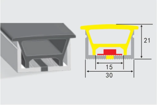
For the upper end of storefront and facade work I commonly step up to a 3020-class body such as the ART-NT3020. It gives a stroke real presence without jumping all the way to the giant 5025 rooftop profiles, which would overwhelm a normal fascia letter.
Matching Tube to Stroke Width, Not Just Letter Height
Letter height gets most of the attention, but stroke width is what physically constrains the tube. The neon has to sit inside the stroke with clearance from the side returns, and it must not be so wide that light spills across the counters (the enclosed gaps in letters like O, A and P).
- As a starting proportion, the tube width should occupy a comfortable share of the stroke interior without touching the returns.
- Check enclosed counters: an oversized tube floods them and destroys letter legibility.
- Remember the bend radius; a large tube cannot make the tight turns that a small logo demands.
Bend Radius: The Hidden Constraint
Every size increase makes the tube stiffer and increases its minimum bend radius. A 0408 will follow a tight script flourish that a 3020 cannot physically make without kinking. So even when a large letter seems to call for a big tube, tight internal curves may force a smaller size or a different construction. I check the tightest radius in the artwork before locking the profile, not after.
Let the tightest feature set the maximum tube size.
| Artwork feature | Size consideration |
|---|---|
| Tight script and serifs | Favours small, flexible mini profiles |
| Bold sans-serif, gentle curves | Allows medium to large tubes |
| Straight block letters | Large tubes are straightforward |
| Small enclosed counters | Limits tube width to avoid light bleed |
How Viewing Distance Changes the Choice
Two signs with identical letter heights can need different tube sizes purely because of where the viewer stands. A fascia read across a pavement at five metres can use a refined mid-size tube; the same letter on a pylon read from a moving vehicle at sixty metres needs a bolder stroke and higher output. When in doubt I move the full-size mock-up to the actual viewing position rather than deciding in the workshop.
The Full-Scale Mock-Up Habit
- Plot one representative letter at full scale with the proposed tube centred in the stroke.
- Mark the counters and tightest corner to check clearance and bend radius.
- Take the mock-up to the real mounting position and view from approach, parking and entry points.
- Light it if possible; an unlit mock-up shows geometry, a lit one shows light bleed and weight.
- Sign off the size before ordering extrusion or cutting a full set of letters.
Ordering the Right Size the First Time
I send the fabricator the letter height, minimum stroke width, tightest bend radius, mounting height and furthest viewing distance. With that information the profile can be chosen to suit the geometry and the distance together. We produce neon across the full size range from 0305 mini profiles up to 5025 large-format tubes, and we are happy to send two or three candidate sizes as samples so the full-scale decision is made on the bench and the street, not from a catalogue number.
Worked Example: Sizing a Real Set of Letters
The chart is easier to trust with a concrete job. A restaurant brand wanted fascia letters 600 mm tall in a bold rounded sans-serif, mounted at 3.5 metres and read by pedestrians and slow traffic from roughly 15 to 25 metres. The strokes were wide with gentle curves and generous counters. My first instinct was a 1212, which is a common storefront default, but at 600 mm tall a 1212 line looked thin in the full-scale plot, especially on the broad strokes. I moved up to a 2020-class tube, which gave the bold letterforms the weight they needed while still clearing the counters comfortably.
The same client had a second site with 250 mm tall reception letters in a delicate script, viewed from under three metres. There the 2020 would have been absurd; a 0816 or 1012 tracked the script without crowding it. Same brand, two tube sizes, because the geometry and distance differed. That contrast is the point I make to every client: there is no house-standard tube, only a size derived from each sign's letter height, stroke width, tightest curve and viewing distance. Plotting one representative letter at full scale for both locations settled the decision in minutes and avoided ordering a single profile that would have been wrong at one site or the other.
Recommended Products
Frequently Asked Questions
How do I choose the right neon tube size for channel letters?
Start from letter height, stroke width and viewing distance. Small interior logos use mini 0305-0816 profiles, standard storefronts use roughly 1012-2020, and tall facade or roadside letters need 3020-5025 large-format tubes. Always check the tightest bend radius and confirm with a full-scale mock-up.
What do neon profile numbers like 1212 or 3020 mean?
They approximate the cross-section dimensions in millimetres, so a 3020 is roughly 30 x 20 mm. The naming convention varies a little between manufacturers and bend types, so treat the number as a guide and confirm the actual dimensions on the product drawing.
Can I use a large tube for a logo with tight curves?
Often not. Larger tubes are stiffer and have a bigger minimum bend radius, so tight script flourishes and small counters can force a smaller profile. Let the tightest feature in the artwork determine the maximum tube size rather than the straight sections.
Does stroke width matter more than letter height?
They do different jobs. Letter height and viewing distance set the visual weight you need, while stroke width is the physical limit on what fits, including clearance from the returns and light bleed into counters. Both must be checked, with the tightest counters often deciding the maximum usable width.
Should I mock up the neon size before ordering?
Yes, especially on large or high-mounted signs. Plot a representative letter at full scale, centre the proposed tube, check the tightest corner and counters, then view the lit mock-up from the real approach positions. A few minutes of mock-up prevents a sign that is under- or over-sized once installed.
Need help with your LED project?
Get factory-direct pricing, free samples and engineering support within 24 hours.
Email: info@arraystarled.com | Phone: +86-0755-2103-6746 | WhatsApp: 0086 1581 8514 077
Need to size your power supply? Use our LED Strip Power Calculator to find the right driver in seconds.