Choosing Neon Tube Diameter by Letter Height: A Field Reference
- 2026-10-28 10:02
- /
- Arraystar LED
I once quoted a six-millimetre tube for a thirty-centimetre letter and watched the client squint at the proof. Tube diameter is not a cosmetic choice, it is the stroke width the eye reads at viewing distance, and pairing it wrong makes the whole sign look thin or blown out.
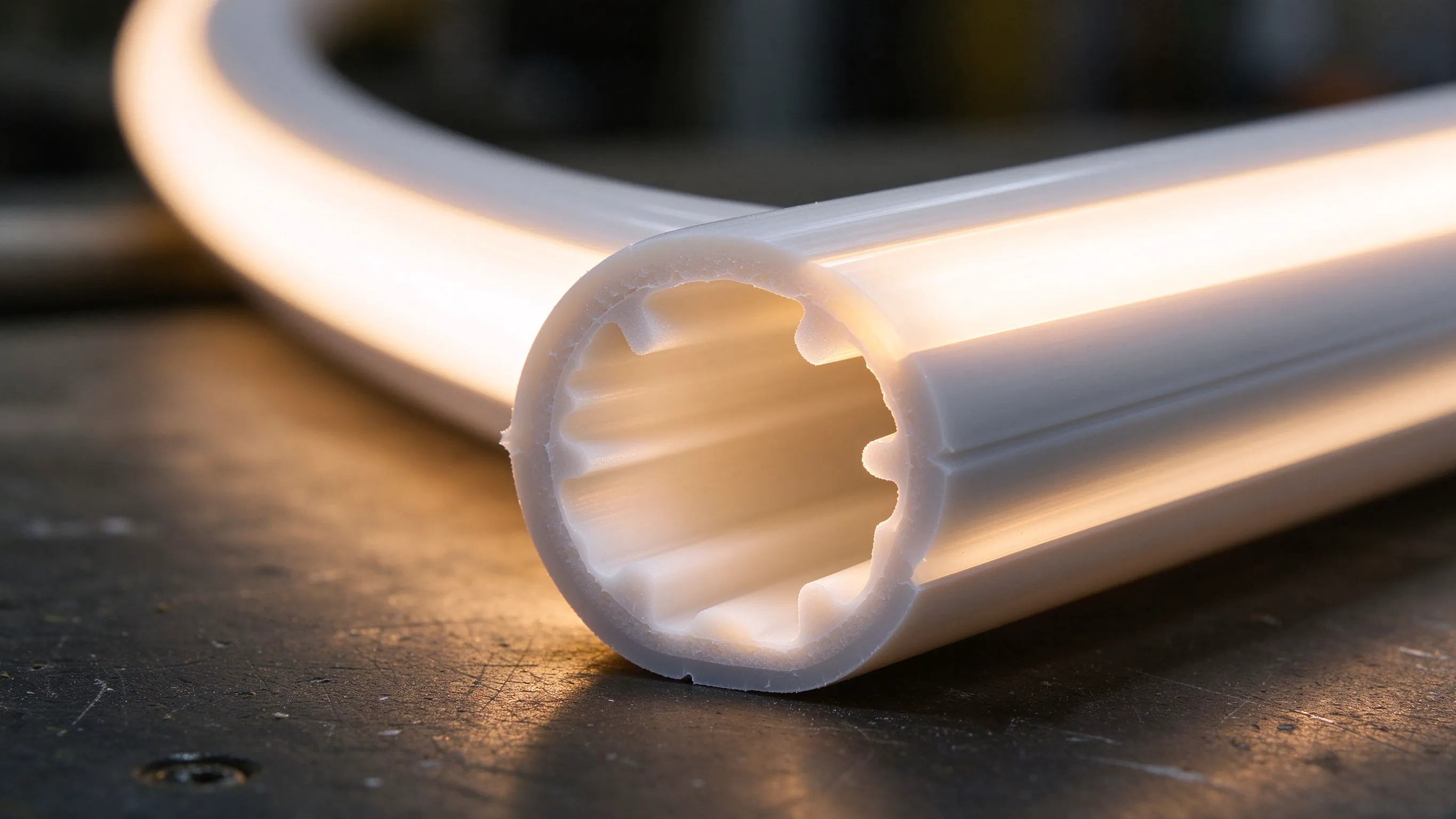
Why tube diameter is really stroke width
When you draw a letter in neon, the tube itself becomes the stroke. A six-millimetre tube on a tall, wide letter looks like a fine-line drawing from across the street, and a fifteen-millimetre tube on a ten-centimetre letter turns into a glowing blob where the holes in the letters disappear. The job is to pick a tube whose luminous width matches the stroke the eye expects at the distance the sign will actually be read.
I learnt this on a shopfront where the client loved the skinny look in the studio but hated it from the pavement. At two metres a 6 mm tube reads crisp; at eight metres it vanishes. The viewing distance drives the minimum stroke, and I now work backwards from where the customer stands, not from what looks good on a flat mock-up.
The two numbers that decide the diameter
- Letter height, which sets the scale of the whole sign.
- Normal viewing distance, which sets the minimum readable stroke width.

The pairing table I use on quotes
Over the years I have landed on a rough ratio: the luminous tube width should sit between a fortieth and a sixtieth of the letter height for a balanced look. That is a starting point, not a law, but it keeps me out of trouble on the first proof. Below a fiftieth the letters look spindly; above a thirty-fifth the counters fill in and the type gets fat.
Match tube diameter to letter height; a 6 mm tube on a 60 cm letter looks thin.
| Letter height | Recommended tube diameter | Stroke-to-height ratio | Reading feel |
|---|---|---|---|
| 10-15 cm | 6-8 mm | 1:15 to 1:20 | Bold, punchy up close |
| 20-30 cm | 10-12 mm | 1:20 to 1:25 | Balanced, normal |
| 40-60 cm | 12-16 mm | 1:25 to 1:30 | Composed at distance |
| 80 cm+ | 16-20 mm | 1:30 to 1:40 | Commanding across the street |
Watch the counters on letters like O, B, R and A. If the tube is too fat, the inner gap closes and the letter reads as a solid shape from the street. I always draw the proposed tube width onto the artwork before ordering, rather than discovering it at install.
When a thinner tube is the wrong call
Clients often ask for the smallest tube because it looks delicate and expensive on a wall. But a thin tube on a large sign carries two penalties. It runs hotter per metre because the LEDs are packed into a smaller cross-section, and it has less mechanical body to survive wind on a facade. I talk clients out of going below 8 mm on any run longer than two metres outdoors, regardless of how elegant it looks in the render.

When a fatter tube is the wrong call
The reverse mistake is reaching for a 20 mm tube because it glows more. On small lettering the diffuser bloom bleeds past the tube edge and softens the whole sign into a halo, and the mounting clips become bulky and obvious against a refined interior. Fat tubes also need bigger bends; a tight ninety-degree corner on a 20 mm tube kinks the diffuser and creates a dark spot. Keep the fat sections for large external characters where the eye is far away.
- Thin tube on large letters: spindly, hot, and hard to read across the street.
- Fat tube on small letters: counters fill in, corners kink, clips look heavy.
- Tight bends on fat sections: plan a corner fitting instead of a sharp bend.
The proofing step before I order
Before any cut length leaves the bench, I print the artwork at real scale and lay a short offcut of the chosen tube across the letters. If the stroke looks right on paper at arm length, it will read right on the wall. This ten-minute check has saved me from two reorders where the ratio on screen looked perfect but the tube on the actual letter looked absurd.

Recommended Products
Frequently Asked Questions
What diameter neon tube do I need for 30 cm letters?
I would reach for a 10 to 12 mm tube on 30 cm lettering. That lands near a 1:25 ratio, which reads balanced from the pavement and across a shopfront. A 6 mm tube would look too thin at that height, and a 16 mm tube would start to fill in the counters on letters like O and B. Ten millimetres is the safe middle.
Can I use a 6 mm neon tube outdoors on a long run?
I would not. A 6 mm tube packs the same LED density into a tiny cross-section, so it runs hotter and ages faster in sun. It also lacks the body to resist wind whip on a facade. For any outdoor run over two metres I keep the tube at 8 mm minimum, regardless of how elegant the thin look sounds in the studio.
Why do my round letters look filled in from the street?
Because the tube diameter is too fat for the letter height. The glow blooms past the tube edge and closes the inner counter, so the O reads as a solid ring. Either step down to a thinner tube, enlarge the letters, or widen the artwork gap between strokes. Draw the tube width onto the artwork before ordering to catch this early.
Does viewing distance change the tube diameter I should pick?
Yes. A thin tube that reads crisp at two metres will vanish at eight metres. The further the viewer stands, the wider the minimum stroke must be, because the angular size of the tube shrinks. Work backwards from where the customer actually stands on the pavement, not from what looks good up close on the studio wall.
Can I bend a 20 mm tube into tight corners?
Not into a sharp ninety-degree bend. A 20 mm section has a large minimum bend radius, and forcing a tight corner kinks the diffuser and creates a dark spot at the fold. Plan a corner fitting or a gentle radius instead. Keep fat tubes for large external characters where the eye is far and the corners can be softened.
Need help with your LED project?
Get factory-direct pricing, free samples and engineering support within 24 hours.
Email: info@arraystarled.com | Phone: +86-0755-2103-6746 | WhatsApp: 0086 1581 8514 077
Need to size your power supply? Use our LED Strip Power Calculator to find the right driver in seconds.