6mm Zigzag Strips for Narrow Channel Letter Strokes and Folds
- 2026-10-09 18:40
- /
- Arraystar LED
Straight strip cannot follow the tight folds and curves inside narrow channel-letter strokes without buckling, lifting or leaving dark gaps. A 6mm zigzag (foldable) strip is laid in a serpentine pattern that absorbs bends and lets the light fill the letter evenly. It is the sign-maker's solution for scripts, serifs and narrow strokes where conventional strip wastes time and looks patchy.
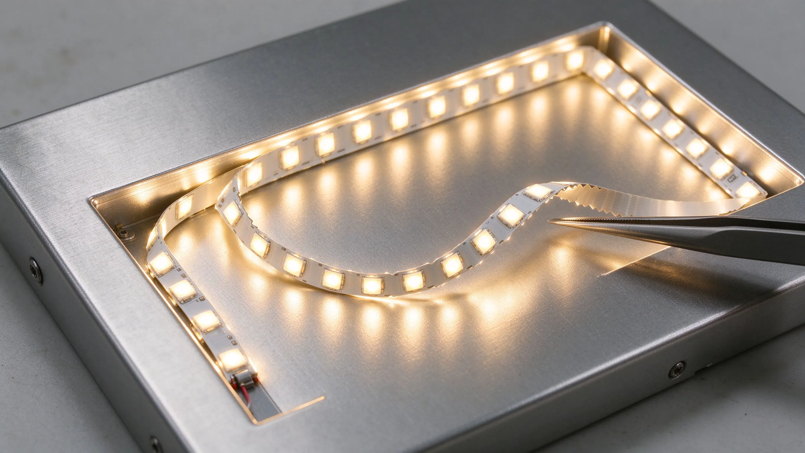
Why Straight Strip Fails Inside Letters
Channel letters are unforgiving interiors: narrow strokes, sharp serifs, tight inner corners and curves that change direction constantly. A straight strip laid along such a path has to be cut, overlapped or forced around each bend. Cut it and you create joins and feed complexity; force it and it buckles, lifts off the backing or bunches, producing hot spots where it overlaps and dark gaps where it pulls away.
Sign-makers waste hours fighting this, and the finished letter still shows uneven light, especially across the tight strokes of script and serif fonts.
What a Zigzag Strip Does Differently
- Serpentine zigzag layout on a narrow 6mm board that flexes in multiple directions.
- Folds around curves and corners without cutting into many segments.
- Absorbs excess length so the strip does not buckle in tight strokes.
- Spreads light across the stroke width for even face illumination.
- Fewer joins and feeds inside a single letter.
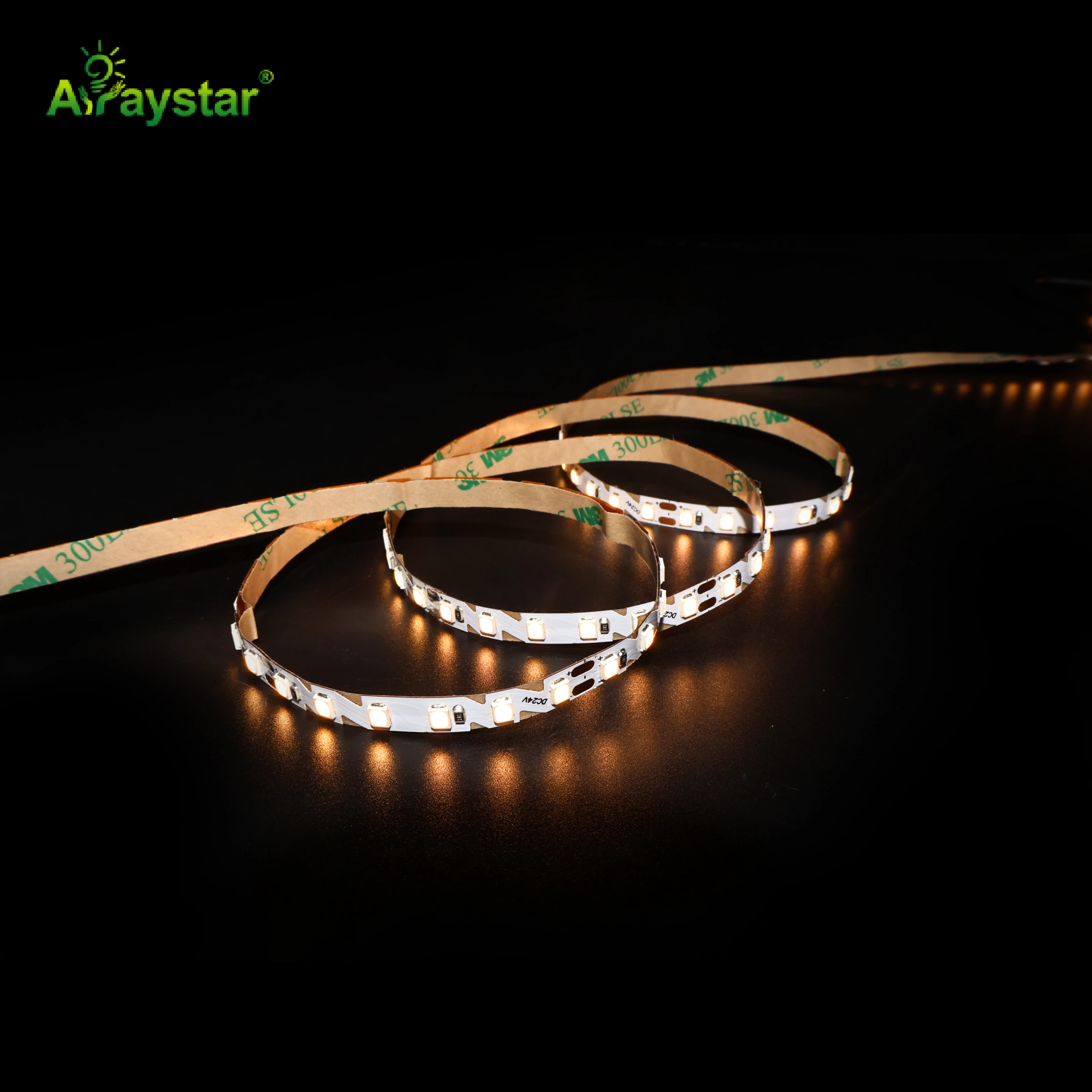
For channel-letter interiors I use the 6mm zigzag strip. The foldable pattern is purpose-built for the geometry that straight strip handles worst.
Straight vs Zigzag Inside a Letter
Zigzag is engineered for sign interiors, not straight runs.
| Challenge | Straight strip | 6mm zigzag |
|---|---|---|
| Tight curves | Buckles or needs cuts | Folds with the stroke |
| Inner corners / serifs | Lifts and gaps | Conforms into the corner |
| Even face brightness | Hot spots and dark gaps | Spread across the stroke |
| Number of joins | Many | Few |
| Fitting time per letter | High | Significantly lower |
Where Zigzag Earns Its Keep
- Script and cursive lettering with continuous curves.
- Serif fonts with fine serifs and tight inner corners.
- Narrow stroke widths that cannot fit multiple straight runs.
- Logos and custom shapes with frequent direction changes.
- Reverse-lit and halo-lit letters needing even backing glow.
How to Lay a Zigzag Strip Correctly
The zigzag pattern works because the folds are planned, not random. I run the strip in a consistent serpentine down the stroke, keeping the folds even so light spreads uniformly, and I avoid compressing the zigzag so tightly that adjacent sections overlap and create hot spots. The pattern density is matched to the stroke: tighter, more frequent folds in narrow sections, gentler folds where the stroke widens.
Practical fitting sequence
- Clean the letter backing and plan the serpentine path before peeling adhesive.
- Dry-lay the zigzag through the tightest strokes to confirm fold spacing.
- Press progressively, keeping folds even and the strip off the side returns.
- Keep feeds and joins at natural junctions or the letter base.
- Power the bare letter before fitting the face to catch gaps early.
Matching LED Spacing to Stroke Width and Depth
Even with a foldable layout, LED density and the letter's depth and diffuser decide whether the face is smooth. Very shallow letters need higher LED density or the zigzag will show scalloping through the face; deeper letters let the light blend before reaching the acrylic. I choose the LED count and fold spacing together so the zigzag fills the stroke without either dark voids or concentrated bright bands, and I test the specific acrylic or face material, because each diffuses differently.
When Straight Strip Is Still Better
Zigzag is a specialist for curves and narrow strokes, not a universal choice. Wide, bold, straight-sided letters and simple block fonts are lit very efficiently with straight runs laid in parallel, which use strip more economically and can be quicker on large simple characters. I use straight strip where the geometry is genuinely straight and reach for zigzag only where folds and tight strokes make straight runs buckle or gap. Mixing both in one sign, zigzag for the script tagline and straight for the bold main letters, is common and sensible.
Specifying Channel-Letter Lighting
Send the font or artwork, stroke widths, letter depth, face material and whether letters are front-lit or reverse/halo-lit. I will confirm where zigzag strip is needed versus straight runs, the LED density for the letter depth, and feed planning across multiple characters. We supply the 6mm zigzag strip and recommend lighting one representative curved letter and one straight letter as a trial before producing the full set, so fold spacing and face smoothness are proven on the real acrylic.
Feeding and Wiring a Full Set of Letters
A sign is rarely one character, and the zigzag work inside each letter is only half the job; getting power to every character evenly is where many channel-letter installations become untidy. I plan the wiring across the whole sign set before fitting any strip, grouping letters into runs that keep the load balanced and the feed cables hidden inside the raceway or backing that mounts the letters to the wall.
- Calculate the total LED load across all characters before sizing the driver.
- Group letters so no single branch is overloaded and brightness matches across the sign.
- Route inter-letter cables through shared backing or a raceway rather than visible loops.
- Keep polarity consistent across the set; one reversed letter stays dark.
- Bring the supply to a serviceable point rather than sealing it permanently behind the sign.
On a multi-word facade sign I treat each word as its own branch fed from a common driver location, which keeps cable runs short within the letters and makes a single failed character easy to isolate without dismantling the whole sign. I also label every letter's feed during assembly, because a set of twenty characters looks identical from the back once it is mounted and tracing an unlabelled wire on a wall at height is a miserable job. The zigzag strip's advantage of fewer joins per letter compounds here: fewer internal joins means fewer points to test when a full set is powered up for the first time. Before the faces go on I light every character together and photograph the result, checking that the script letters filled with zigzag match the block letters filled with straight runs in both colour and brightness, because mixing two strip layouts in one sign can reveal a subtle output difference that is far cheaper to correct on the bench than after installation.
Recommended Products
Frequently Asked Questions
What is a zigzag or foldable LED strip used for?
It is a narrow strip, commonly 6mm, laid in a serpentine zigzag pattern so it can fold around the curves, corners and narrow strokes inside channel letters without being cut into many segments. It spreads light across the stroke and avoids the buckling, hot spots and dark gaps that straight strip creates in script and serif letters.
Why does straight strip look patchy inside curved letters?
Forced around tight bends, straight strip buckles, lifts off the backing or overlaps, creating bright overlaps and dark gaps, and it often needs many cuts and joins. A zigzag layout flexes with the stroke and keeps folds even, so the light fills the letter face uniformly with far fewer joins.
How tightly should I fold the zigzag pattern?
Keep the serpentine folds even and match their density to the stroke: tighter, more frequent folds in narrow sections and gentler folds where the stroke widens. Do not compress the zigzag so much that adjacent sections overlap and create hot spots; dry-lay the tightest strokes before fixing and power the bare letter before fitting the face.
Does letter depth matter when using zigzag strip?
Yes. Shallow letters give light little room to blend, so they need higher LED density and careful fold spacing or the zigzag shows scalloping through the face; deeper letters let light blend before the acrylic. Test with the actual face material, since different acrylics diffuse differently.
Should I use zigzag strip for all channel letters?
No. Wide, bold, straight-sided block letters are lit more economically and quickly with parallel straight runs. Use zigzag for scripts, serifs, narrow strokes and logos with frequent curves and corners; it is common to mix both, zigzag for a curved tagline and straight for bold main characters, in one sign.
Need help with your LED project?
Get factory-direct pricing, free samples and engineering support within 24 hours.
Email: info@arraystarled.com | Phone: +86-0755-2103-6746 | WhatsApp: 0086 1581 8514 077
Need to size your power supply? Use our LED Strip Power Calculator to find the right driver in seconds.